
WEBSITE REDESIGN FOR DEUS EX MACHINA
for a personalized e-commerce experience
PROJECT BRIEF
Website redesign for Deus Ex Machina to give their customer more personalized experience depending on their various needs
DURATION
2 Weeks in March 2019
TEAM OF THREE
Nura Lim X Patrick O’leary X Alasdair Barrie
MY ROLE
UX Lead which including below:
- Identifying Problems Phase:
Conducting Customer Interview, Contexture Inquiry, Research Synthesis, Defining Users, Building Personas, Creating Customer Journey, Value Proposition Map, and User Flow, Feature prioritization
- Design Studio Phase:
Wireframing, prototyping for Die Hard Persona, Usability Testing, Iterating Design
TOOLS
Google Forms, Paper Prototype, Sketch, Axure RP 8, Keynote
INTRO
Deus Ex Machina is a trendy clothing and motorcycle brand that also has a showroom, cafe, and headquarters in Sydney. Under their inclusive, authentic and enthusiastic brand identity, they hold events with various interests such as surf, motorcycle, and casual food and drinks to create a connection with customers on multiple levels.
Despite its high in brand awareness and popularity, their website shows a lot of conflicts and needs an easier and clearer way to navigate users to their desired information according to their various interests.

PROJECT PLAN
We minimised the stages which led us to conduct rapid design iterations to achieve the project goal within the time frame
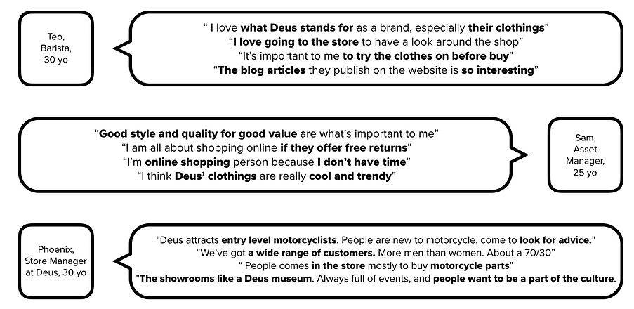
Through customer interviews and contextual inquiry at the Deus Ex Machina showroom in Camperdown, we realized that customers shop Deus for various purposes and they expect different information depending on their interests.
Also, even though it’s famous for the motorcycle culture, the volume of e-commerce shop usage is high enough to consider as a future improvement.
Deus Ex Machina website has a broken user journey which has no clear links between menus, doesn’t give enough information for the e-commerce site users, and the navigation was not organized well enough. This directed us to discover ways we can strengthen the brand experience as a whole on the website and create personal connections for the customers who have different interests in Deus.
PROBLEM STATEMENT
Deus Ex Machina need a way to improve their website experience because it left a lot to be desired from a customer experience perspective
PERSONAS

Now we know the three primary personas, we created the combined customer journey that helped us define the stages where most of the pain points occur

MAIN PAIN POINTS
- Lack of in-store experience i.e. music, photo gallery, etc.
- The complicated and duplicated navigation bar
- Separated online shopping page
- Confusing homepage layout with a bunch of blog articles
- Interesting articles but not organized well
- No filter on product page
- Hard to make a decision with the product description now
- No free return policy
- Manually completing info at checkout
SOLUTION STATEMENT
The website needs more personalized, intuitive online experience for the customers with various interests
OBJECTIVE OF WEBSITE REDESIGNING
1. Making the website intuitive
The main components on the website especially the navigation and information on each page should be simplified and easy to navigate from when customers land on the home page till they finish check out
2. Personalized experience
Customers visit the online website with different interests. The website should provide personalized information so that they embrace the online experience and also achieve their goals
3. Descriptive product details
Customers should be confident in making a purchase with the product information given on the website. For that, the website needs more information and educational description of each product
4. Combination of the online and in-store experience
As the store is the place where Deus’ history began, the in-store experience should be presented more online such as a music player and the visual style to build more brand connection with customers


RAPID DESIGN ITERATION
Based on the MVP, we went separate to design for each persona. I had ownership over the end-to-end design process including usability testing between design iterations for Tommy The Die Hard. As tools, we used hand sketch, Sketch, and Axure
HOME PAGE WIREFRAME FOLLOWED BY A/B TESTING

FINDING FROM A/B TESTING
HOME PAGE
- 4/5 Preferred the Shop Insta function as it’s more familiar with them
- 4/5 Really positive with the player as long as it’s controllable
- 3/5 Still want to see the blogs on the home page
NAVIGATION BAR
- 4/5 Preferred the horizontal menu
- 3/5 Wanted to see the free shipping information upfront
- 3/5 Wanted to have a combination of drop down and horizontal menu
HOME PAGE ITERATION
- Blog section has been enlarged because of users' high in interest (3/5)
- Shop Insta function has been moved down and downsized as users understood without description (4/5)
_edited.jpg)
PRODUCT LIST PAGE ITERATION
- Users preferred the two column layout because it takes less effort for scrolling (4/5)
- ‘Refine Search’ button added for customer’s convenience
.jpg)
PRODUCT DETAIL PAGE ITERATION
- Enlarged the product photo space and made it slidable instead of clicking to the next photo as a mobile-friendly design
- ‘Find Your Fit’ function added and is showing in step-by-step instead of the sidebar with all the option in one page
_edited.jpg)
HI-FI
AND FUTURE RECOMMENDATIONS
• Further usability testing with more target users to continue streamlining the shopping experience.
• Work alongside with developers team to further understand the feasibility of the current/future designs
• Direct comparison page between the products to allow users to better compare products, as seen in
user testing
• Push to market and track user bounce rates to identify if there are any points in the user flow that need further
improvement
• Find out the area has opportunity to provide personalised information and develop further